Project
WE+YOU
A Texas wedding and events studio running four boutiques under one roof, shown as it ran in 2014
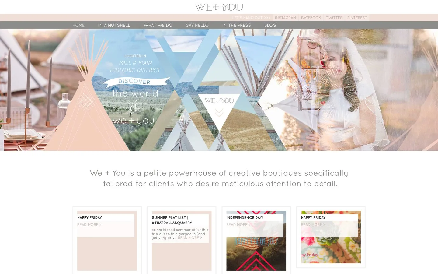
WE+YOU was a wedding and events studio in Lewisville, Texas, working across Texas and Colorado. It was really four small businesses under one name: Pulp for custom stationery, Nest for floral and event styling, Main Social for gatherings and shared tables, and Blue Print for the planning. The site was designed by Dreamachine; the client worked with me directly, and I built it.
The screens on this page are the site as it ran in 2014, taken from a web archive. The old address no longer serves the site, so nothing here describes what lives there today.
Project Scope
- Built the site from Dreamachine's design
- Four named divisions under one front door
- Press coverage and blog
- Reshaped itself for phones and tablets
- Built and looked after entirely remotely
The challenge
Four businesses under one name is a gift and a trap. The gift is that a couple planning a wedding can get their stationery, flowers, venue styling and planning from people who already talk to each other. The trap is a website that tries to say all of that at once and ends up saying nothing, or four separate sites that throw the shared name away.
And because this is weddings, the site could not just be organised. It had to feel like something. People hire an events studio on atmosphere, and the atmosphere has to arrive before the explanation does.
What I built
One site with a strong shared front, and a clean route from the front door to each of the four rooms behind it. The mood arrived first, the structure right behind it.
A first screen that set the mood
The homepage opened on a full width collage, tipis, desert hills, a couple, stitched together in the studio's soft palette. Before a visitor read a word, they knew what a WE+YOU event would feel like.
Four rooms behind one door
Pulp, Nest, Main Social and Blue Print each had their own part of the site, reached from a shared What We Do page that introduced them together and pointed a visitor to each one. A couple could hire one boutique or all four without ever feeling lost between them.
Press given its own shelf
An In The Press page gave the studio's coverage its own home. For a business sold on taste, being featured is proof, and proof deserves better than a mention in a footer.
Reshaped for every screen
The site reshaped itself for whatever screen it landed on. Weddings travel by recommendation, and a recommendation gets opened on a phone, so the small screen got the same care as the big one.
Across the site
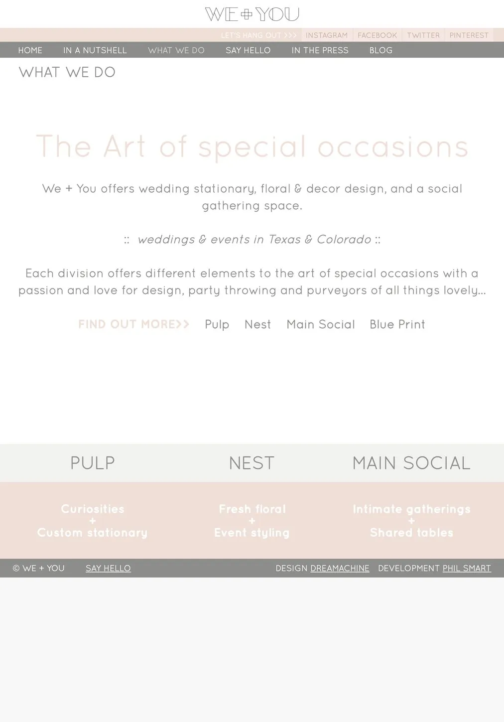
What We Do: the four boutiques, introduced together
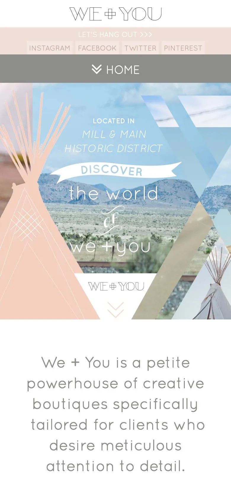
The homepage, reshaped for a phone
The result
Four businesses got one address, one atmosphere and one front door, without any of them being flattened into a list of services. The relationship ran on well past the build, with the site maintained and looked after from the other side of the world for years afterwards.
The shape is worth stealing. If you run more than one offer under a shared name, the answer is usually not more websites. It is one site confident enough to hold them all, with a clear route to each.
If that sounds like your business, see how I approach a website build, read the Tina Bangel project, which solved the same problem for two programmes, or get in touch.
Common questions about this project
By giving each one its own room and one shared front door. WE+YOU ran wedding stationery, floral and event styling, a gathering space and event planning as named divisions, and the site introduced them together, then let a visitor step into whichever one they came for.
Yes. This studio was in Texas, working across Texas and Colorado, and the whole engagement ran remotely. Distance matters less than clarity: agreed designs, clear decisions, and a working rhythm that never needed us in the same room.
Atmosphere first, because people are buying a feeling for their day, then proof, then an easy way to start a conversation. The design here led with a big collage that set the mood in one screen, and every page ended somewhere a visitor could say hello.
Yes. It reshaped itself for whatever screen it landed on, which in 2014 was still a decision rather than the default, and for a business spread by wedding guests telling each other about it, phones were where those conversations landed.
The studio's old web address no longer serves the site, so the screens on this page come from a web archive and show it as it ran in 2014. Nothing here describes what lives at that address today.