Project
Tina Bangel
A vocal coach and music educator with two very different programmes under one website
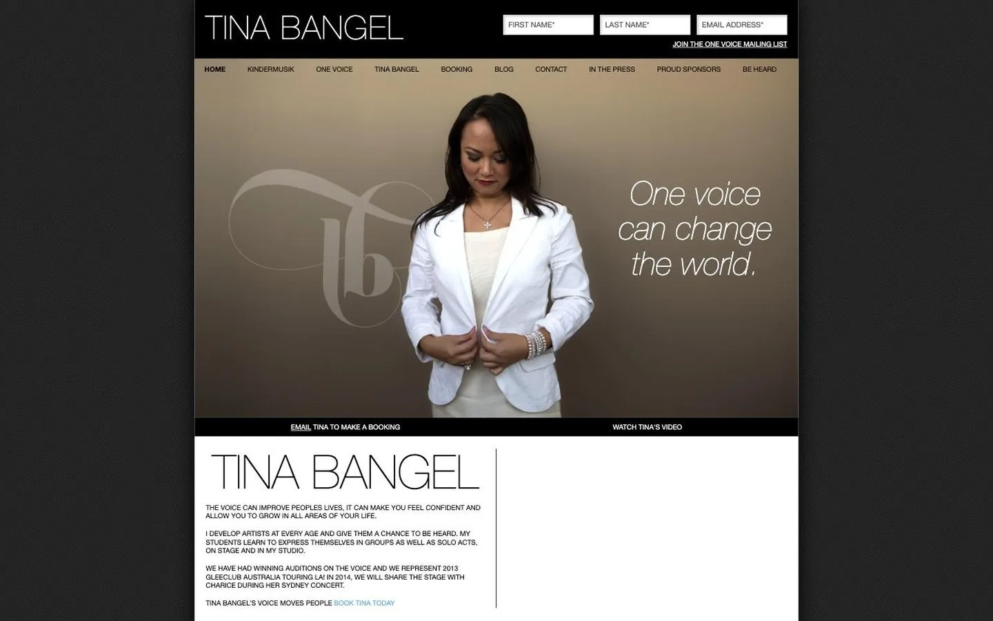
Tina Bangel is a vocal coach and music educator. At the time of this build her business ran on two legs: Kindermusik, music classes for young children, and One Voice, her singing tuition, which ran under the line Be Heard. She also took bookings as a performer. Three things, three audiences, one name across the top. The site was designed by Dreamachine, the studio who then introduced me to Tina directly, and I built it.
The screens on this page are the site as it ran in 2014. It has since been replaced, so what you see here is the work, not the current site.
Project Scope
- Two programmes, each with its own sign up path
- Class times, pricing and enrolment pages
- Mailing list sign up throughout
- Works properly on phones and tablets
- Design by Dreamachine
The challenge
A parent looking for a music class for a small child and a singer looking for coaching want almost nothing in common. They arrive with different questions, they are ready to commit at different speeds, and they will each abandon a site that makes them read past the other one. The usual answer is two separate websites, which doubles the cost and splits a personal brand in half.
The other pressure was that this was one person's business. Every extra page is a page somebody has to keep up to date, so the site went into detail where it mattered and stayed short everywhere else.
What I built
One site, split into two sections that each behaved like their own small website, with Tina's own pages sitting between them. A visitor picked their side in the first click and never had to think about the other one again.
Two programmes, kept apart
Kindermusik and One Voice each had their own pricing, common questions, student reviews and enrolment page. The children's classes also carried their own class list and timetable, because parents book around a timetable and singers do not. A parent and an aspiring singer were never reading the same page as each other.
Enrolling made obvious
Both programmes ran the same short path: what it is, what it costs, and how to enrol, with the children's classes adding a timetable. No hunting, and no emailing to ask a question the page should have answered.
A way to stay in touch
Most visitors are not ready to enrol the day they arrive. A sign up form sat at the top of the page, and further down a second one offered a free guide in exchange for an email address, so interest that was not yet a booking did not simply walk away.
Her actual voice, on the page
For a singing teacher, text can only go so far. Video sat on the home page so a visitor could hear her before deciding, and there was a separate route for people who wanted to book her as a performer rather than learn from her.
Across the site
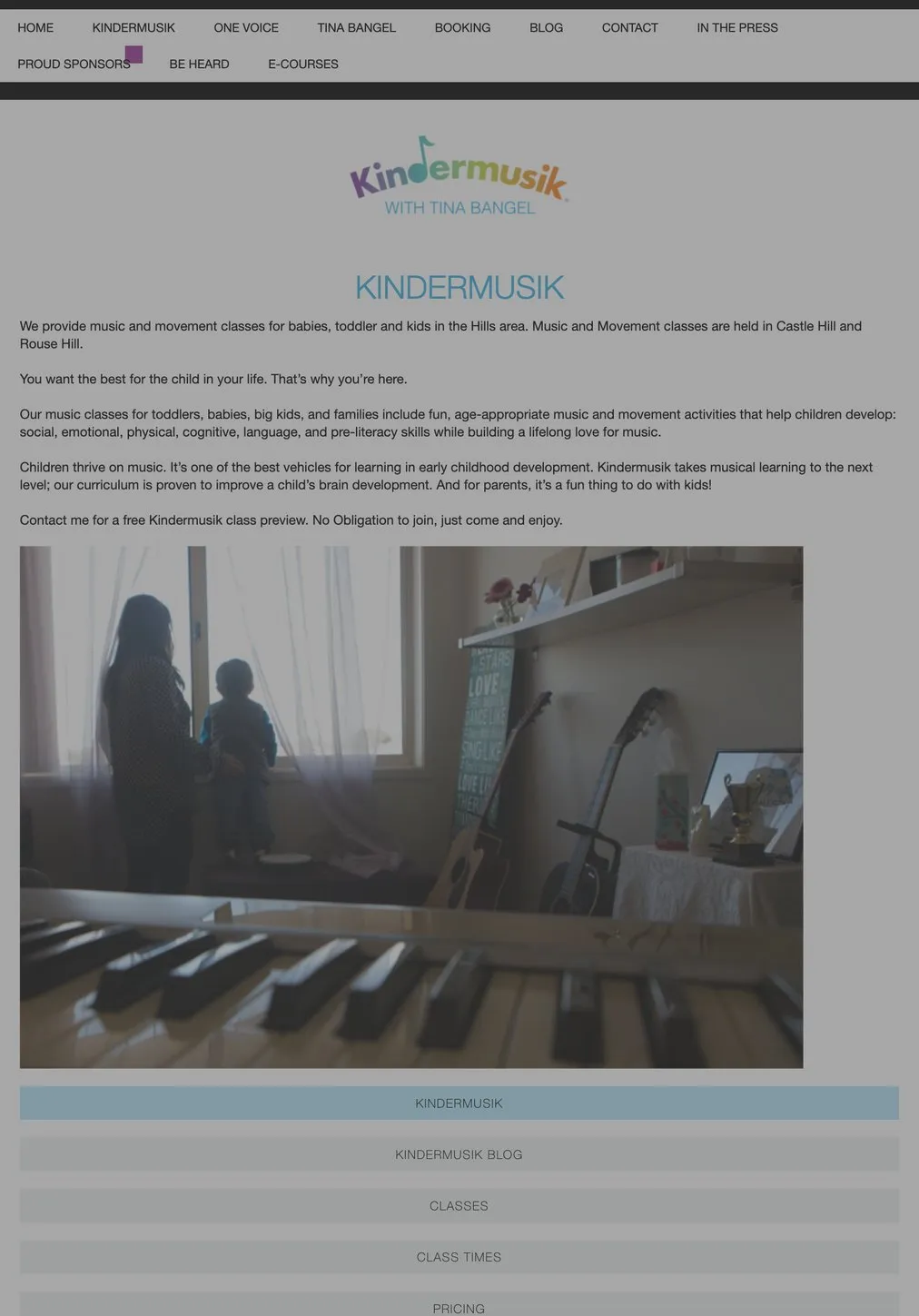
Kindermusik: the section for parents
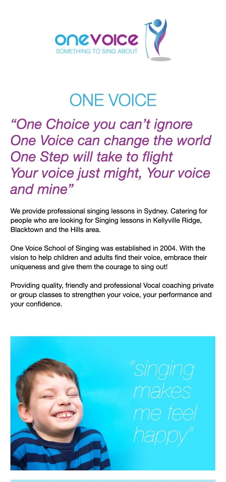
One Voice: the section for singers
The result
Tina got one website that worked as two, without paying for two or splitting her name across them. Each programme had its own web address, so a flyer for the children's classes and a conversation with a singer she was coaching could each send someone straight to the right page.
It is a shape that suits a lot of small businesses better than they realise. If you are running two offers that share your name but share nothing else, one site with two clean halves usually beats either compromise: cramming them together, or maintaining two of everything.
If that sounds like your business, have a look at how I approach a website build, read the Brave Therapy project, or get in touch.
Common questions about this project
Yes, and it is more common than people expect. Tina taught music to small children and coached singers who wanted to be heard, which are two different businesses with two different customers. Each got its own part of the site with its own pricing, questions and sign up, so nobody had to wade through the other one to find what they came for.
The four things a parent or a student asks before they commit: what the classes actually are, when they run, what they cost, and how to enrol. If someone has to email to ask something the page could have answered, a good number of them will not bother, and you never hear from them.
Because most people are not ready to book on their first visit. A mailing list lets someone say they are interested without committing to anything, and it means the business keeps a way of reaching them. On this site the sign up sat at the top of the page and again further down, so it was always within reach.
Yes. It reshaped itself for whatever screen it landed on, phone, tablet or desktop. Parents checking class times on the way out the door were exactly the people it needed to work for.
Yes. They tend to work the same way: the person is what draws people in, the classes or programmes are what people sign up for, and signing up has to be easy to find. Getting that last part right usually matters more than anything else on the site.