Project
Kim Beach
A fitness and nutrition brand built around training programs, recipes and community, shown as it ran in 2016
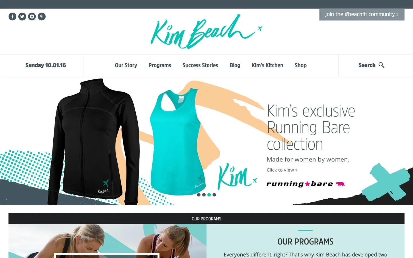
Kim Beach is a fitness and nutrition brand built around one person and the community behind her. The website carried her paid training programs, her success stories, a recipe library called Kim's Kitchen, a blog and a shop, all under a hand drawn script logo that made the whole thing unmistakably hers. The site was designed by The National Grid, and I built it.
The screens on this page are the site as it ran in early 2016, taken from a web archive. The address no longer serves this site, so nothing here describes what lives there today.
Project Scope
- Built the site from The National Grid's design
- Paid training programs, each with its own pitch
- Recipe library, blog and success stories
- A shop alongside the content
- Reshaped itself for phones and tablets
The challenge
A personal fitness brand asks a lot of one website. It has to sell programs, and a program is something people weigh up before buying. It has to publish constantly, because recipes and articles are what keep the audience warm between purchases. And it has to feel like the person, because the person is the reason anybody is there at all.
Sites like this usually fail by becoming a pile. The shop crowds the content, the content buries the programs, and the visitor who arrived ready to commit cannot find the thing they came to buy. The structure has to hold all of it apart while the brand holds it together.
What I built
One site with six clearly named rooms: her story, the programs, the people who had done them, the blog, the kitchen and the shop. Every part fed the next, and all of it wore the same handwriting.
Programs a visitor could choose between
The programs page presented her offerings one after another, each with its own name, its own pitch and its own way in, including versions built for training at home. It was built so somebody arriving unsure could work out which one was theirs.
Proof from real people
Success stories got their own place in the menu rather than being scattered as quotes. For something people weigh up first, like a training program, other people's results are the argument that matters most.
A kitchen full of reasons to return
Kim's Kitchen collected her recipes in their own library, separate from the blog. Food content brings people back week after week, and every return visit put the programs back in front of them.
A community with a front door
A standing invitation to join the community sat at the top of the homepage. The brand ran on belonging as much as on programs, and the site treated joining as a first step anyone could take today.
Across the site
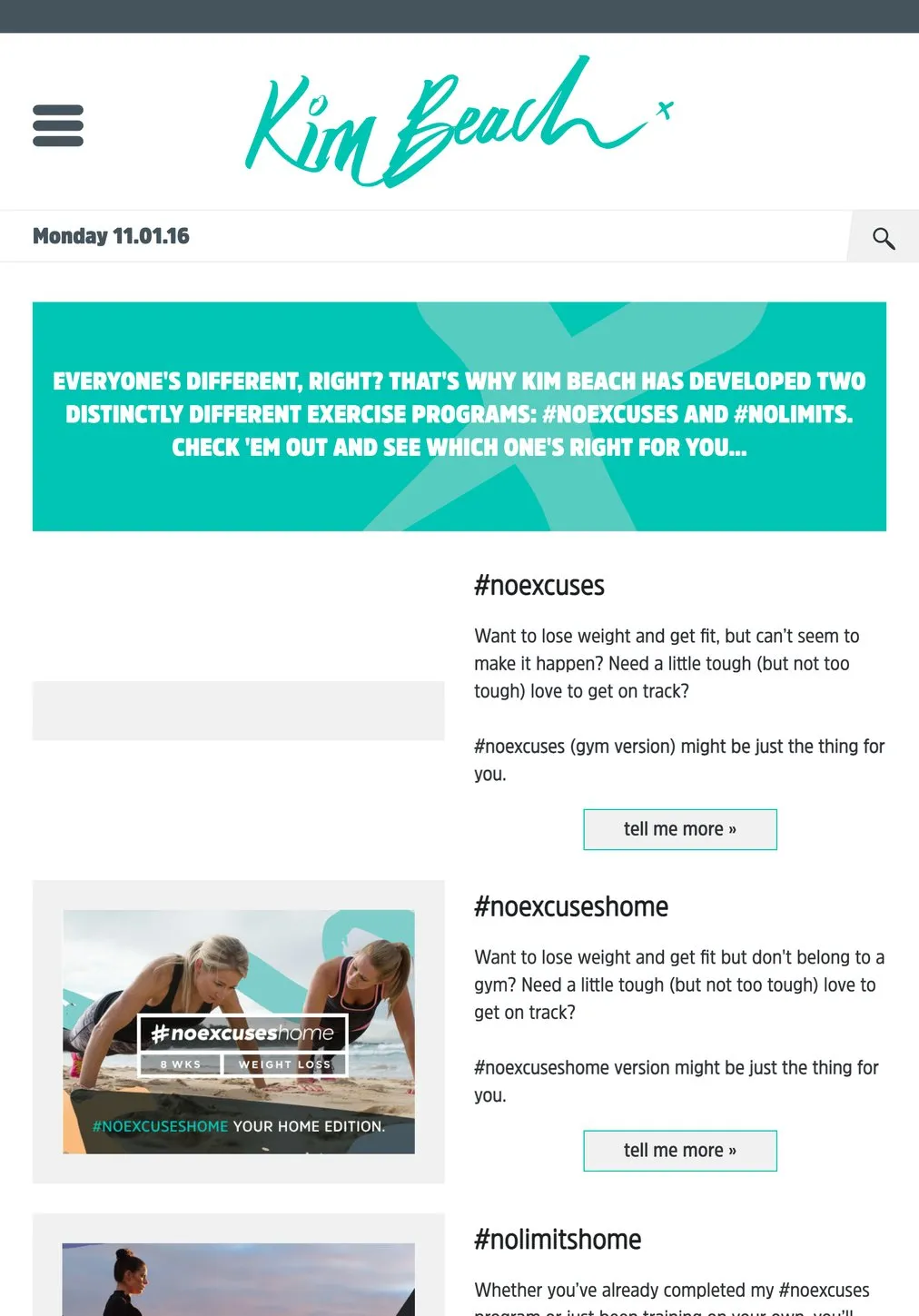
Programs: each with its own pitch and way in
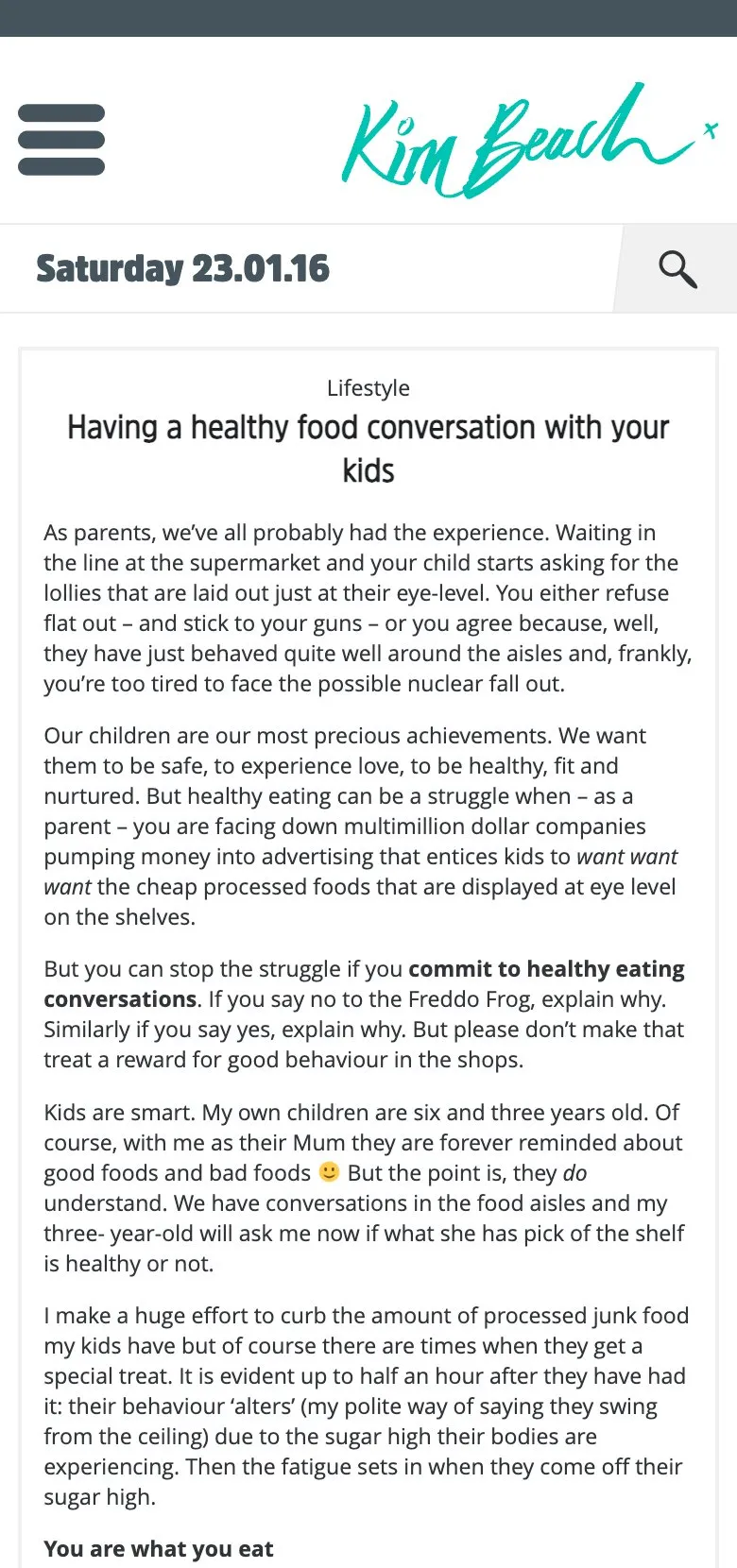
An article, read on a phone
The result
A site that could sell something people weigh up first and publish like a magazine at the same time, without either job getting in the other's way. The programs had room to persuade, the content had room to grow, and the brand's handwriting ran through all of it.
If you are building a business around your own name and expertise, this is the shape to study: the person up front, the offer clearly separated from the content that markets it, and a site that gives people a reason to come back before they are ready to buy.
See how I approach a website build, read the Tina Bangel project for another personal brand with programs behind it, or get in touch.
Common questions about this project
Carry the person, sell the programs, and keep people coming back between purchases. This site did all three: her name front and centre, her programs each with their own pitch and a clear next step, and recipes and articles giving people a reason to return.
A product is bought once. A program is a commitment, so the page has to answer a harder question: is this the right one for me? This site split the programs by what somebody was trying to achieve and where they wanted to train, so choosing felt like being guided rather than being sold to.
Because most visitors are not ready to buy on day one. Recipes and articles gave people a reason to keep visiting and something worth sharing, and every return visit was another chance for a reader to become a customer.
Yes, if the structure is decided early. This site carried programs, success stories, a blog, a recipe library and a shop, each in its own clearly named place, without the homepage turning into a noticeboard. The menu did the sorting so the visitor never had to.
The address no longer serves this site, so the screens on this page come from a web archive and show it as it ran in early 2016. Nothing here describes what lives at that address today.