Project
Nick Evans Photography
A Brisbane wedding photographer's website, built around the work and shown as it ran in 2014
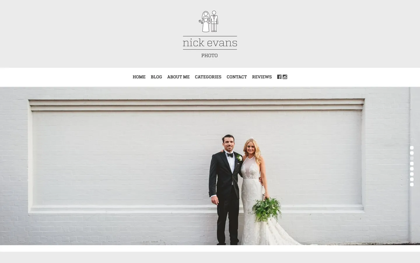
In 2014, Nick Evans was a Brisbane wedding photographer whose website was working against him: a generic template made for photographers in general, not for his work in particular. The new site was designed by Dreamachine, the studio who then connected me to Nick directly, and I built it. It put the photographs first and sorted them the way couples actually look for a photographer.
The screens on this page are the site as it ran in late 2014, taken from a web archive. The web address now points to an unrelated business, so nothing here describes what lives there today.
Project Scope
- Built the site from Dreamachine's design
- Replaced an off the shelf template
- Work sorted into wedding categories
- Blog, reviews and contact pages
- Reshaped itself for phones and tablets
The challenge
A wedding photographer is hired on feel. Couples are not comparing feature lists, they are looking at photographs and asking whether they can see their own day in them. A generic template gets in the way of that twice over: it looks like every other photographer using it, and it organises the work its own way rather than the way a couple goes looking for it.
The other pressure was where the looking happens. By 2014 couples were passing photographers around by phone, and a site that fell apart on a small screen was quietly losing referrals it never knew it had.
What I built
A site where one photograph at a time fills the screen and everything else stays out of its way. Six pages, each doing one job, with the work itself carrying the persuading.
The photographs, full width
The homepage opened on a single photograph filling the screen, with more behind it. No grid of tiny thumbnails, no design fighting the work. A couple landing here saw wedding photography before they saw anything else.
Sorted the way couples search
The work was organised into categories a couple would actually pick from, including country weddings as their own collection, so somebody planning a farm wedding went straight to farm weddings. The filing works for the customer, not the photographer.
A blog that kept the site alive
The blog gave each wedding room for its own story, something couples could send each other and a way to keep fresh work on the site. For a business sold on word of mouth, a wedding post is a shareable piece of proof.
Reviews given their own room
A whole page of couples in their own words, at length. Wedding photography is bought on trust, and nothing builds it like other couples saying the day was safe in his hands.
Across the site
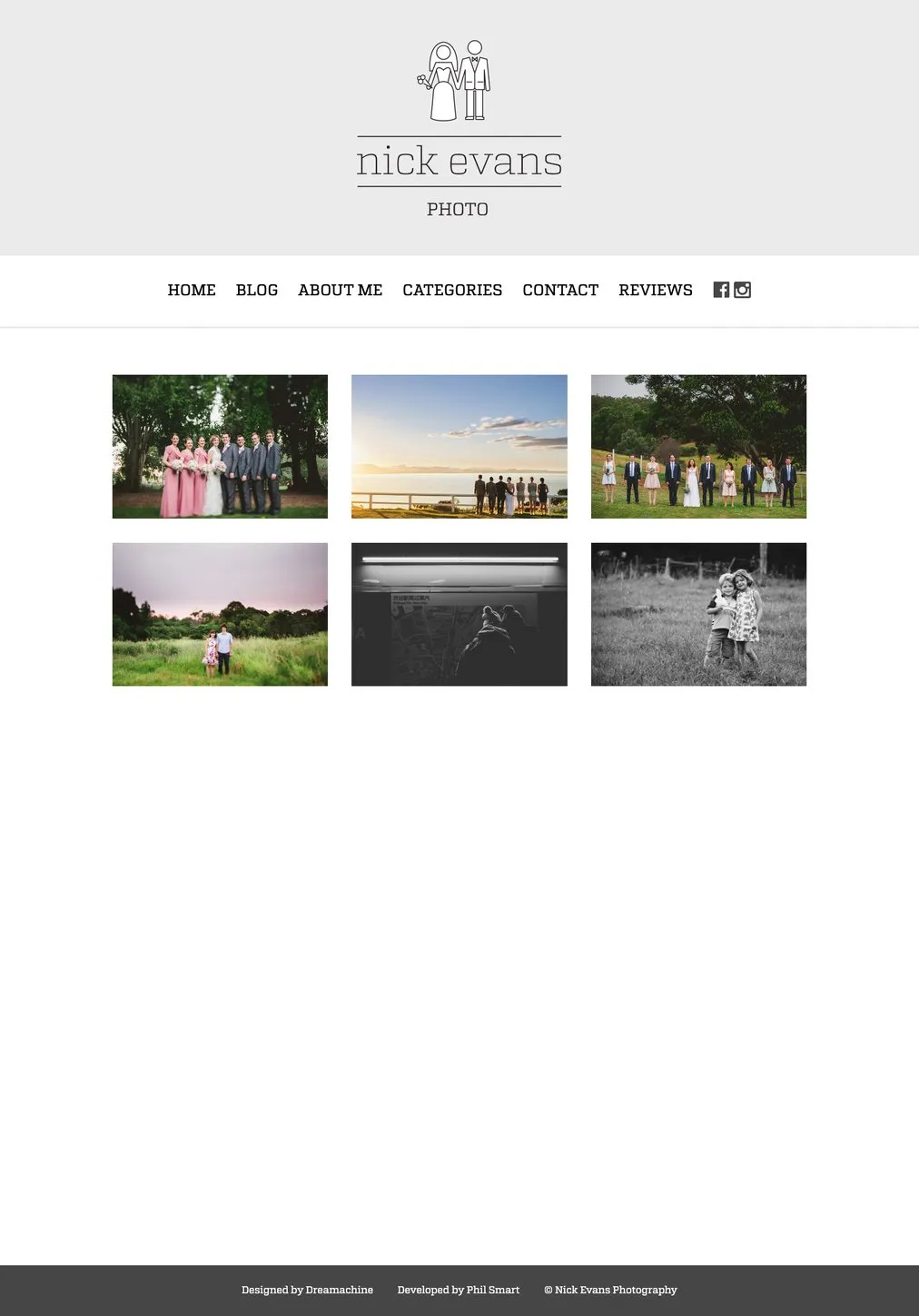
Categories: the work, sorted for couples
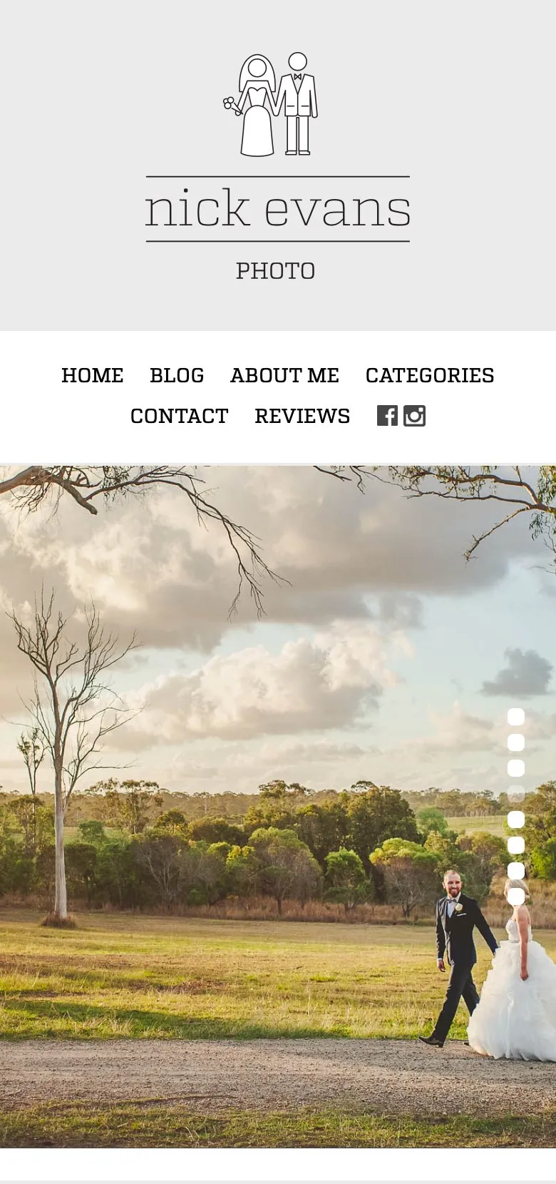
The homepage, reshaped for a phone
The result
Nick went from a template that could have belonged to anyone to a site that could only have been his: his photographs at full size, his categories, his couples doing the talking on the reviews page. And it read properly on a phone, where wedding recommendations get opened.
The thinking here has not dated. If your business is bought on the strength of what people can see, the website's job is to get out of the way of the work and organise it the way your customers search, not the way your files are kept.
If that sounds like your business, see how I approach a website build, read the FotoMoto Tours project, or get in touch.
Common questions about this project
Because couples do not browse the way photographers file. Somebody planning a country wedding wants to see country weddings, not scroll a decade of everything. This site sorted the work into the collections couples actually pick from, country weddings among them, so a visitor landed on the work that looked like their own day.
More than most. Couples share photographers with each other from the couch, and a recommendation gets opened on a phone within a minute of being sent. This site reshaped itself for whatever screen it landed on, which in 2014 was still a decision rather than the default.
That the pictures stay the point. The design here put one photograph at a time in front of the visitor, full width, with the menu and the logo kept plain above it. The wrong move on a photography site is a design that competes with the work it exists to show.
He had been on an off the shelf template built for photographers in general. The new site was built for him specifically: his categories, his blog, a reviews page for word of mouth, and pages that read properly on a phone. That is the usual trade, a template is cheap and generic, a build fits the actual business.
Yes. The shape has aged well: a strong visual lead, work sorted the way customers search it, reviews doing the persuading, and an easy way to get in touch. It suits photographers, and it suits any business whose work is best shown rather than described.