Project
First Off The Bike
An Australian triathlon publication, built from a supplied design and shown as it ran in 2015
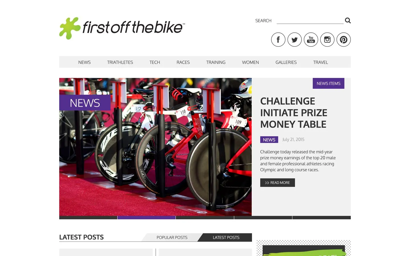
First Off The Bike was an Australian triathlon publication, covering racing, the athletes, gear, training and travel. I built the website. The design came from the client's side rather than from me, and my job was turning it into something that worked and could hold years of publishing.
The screenshots on this page are the site as it ran in 2015, taken from a web archive; the world map further down is from the design set the site was built to. The publication has since closed and the address now points at something unrelated, so nothing here describes what lives at that domain today.
Project Scope
- Built the site from the designs supplied
- Eight sections, most with their own sub-sections
- Photo, video and podcast galleries
- A travel section with its own guides
- Display advertising built into the pages
- Works properly on phones and tablets
The challenge
Triathlon covers three sports and a lot of ground. The publication wrote about racing, the professionals, the weekend competitors, swimming, cycling, running, gear, coaching, nutrition, women's racing and travel. All of that had to be reachable from one menu without the menu becoming a wall of words.
The other half of it was that a publication accumulates. Whatever shelving gets chosen at the start is the shelving you live with, and a structure that copes with fifty articles can collapse under a thousand. Getting it wrong is not something a new coat of paint fixes later.
What I built
Eight sections across the top, and beneath most of them a set of sub-sections a reader could drop into directly. The whole structure was agreed on a single sheet of paper before anything was built. It is an hour of work that saves weeks later.
A shape agreed before anything was built
Every section, every sub-section and every kind of page on one sheet, signed off first. On the finished site, races broke into six kinds of event and tech broke into swim, bike, run and gear, exactly as the sheet said they would. Nobody discovered a whole kind of page nobody had thought of, halfway through.
Galleries as their own destination
Photos, video and podcasts each got their own home rather than being buried inside articles. For a sport that produces this much photography, the pictures are half the reason people come back.
A travel guide you browse by map
The travel section was designed to open on a world map with the regions marked, so a reader planning a race abroad could pick a part of the world rather than scroll a list of place names, with a dropdown for anyone who preferred it.
Advertising with a place to live
The pages carried purpose-built spaces for display advertising, sized and positioned so an ad could earn its keep without wrecking the reading. For a publication, that is the difference between advertising as income and advertising as clutter.
Across the site
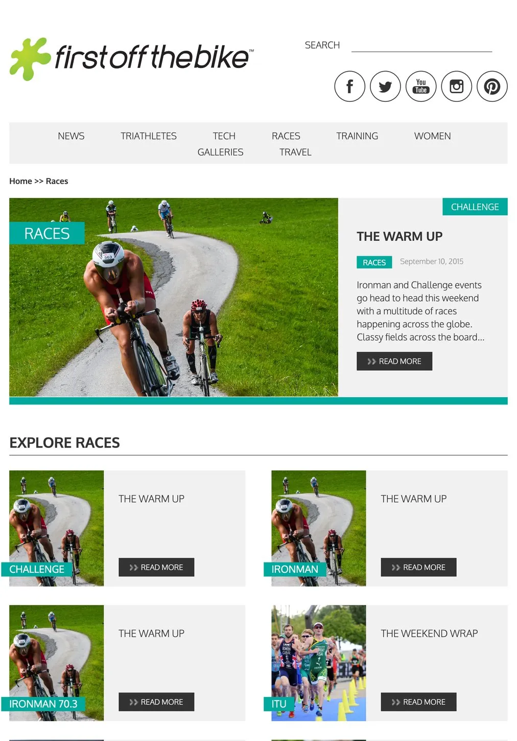
Races: each kind of event with its own shelf

A travel article, read on a phone
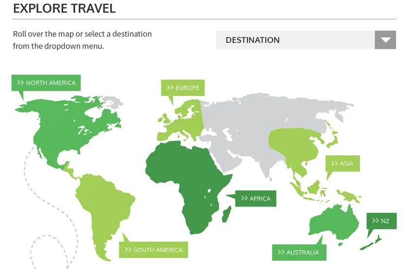
From the supplied design set: the travel section was designed to open on a world map rather than a list
The result
The site shipped, and it ran the way the sheet said it would: eight sections carrying three sports, the whole spread of racing from the professionals down to weekend competitors, and a travel section that behaved like its own small guide. It read properly on a phone, which mattered for an audience that does most of its reading between training sessions.
It also sits in a run of publications. Between this, CyclingTips, WhichCar and 4X4 Australia, four titles across cycling, triathlon and motoring, all with the same underlying problem: a lot of content, arriving constantly, that has to stay findable.
If you publish and your website is starting to feel like a filing cabinet nobody can open, that is fixable. See how I approach a website build, or get in touch.
Common questions about this project
Often, and it is a normal way to work. A designer or an agency hands over the page designs and I turn them into the working site. It suits businesses who already have someone they trust on the visual side, or who have had a brand designed and now need it built.
It depends entirely on how much you publish. A business with six pages should not have eight sections. A publication putting out articles every week needs enough shelving that a reader can find last month's piece, and it needs deciding up front rather than bolted on later once the mess has set.
It is a single sheet showing every section, what sits under it, and which pages share a layout. Agreeing it before anything is built is what stops the expensive version of this conversation happening halfway through, when a whole section turns out to need a kind of page nobody had planned for.
Yes, and sometimes you should. The plan for this site kept the shop where the business already ran it, on its own platform, rather than rebuilding it as part of the new site. That meant no second shop to keep stocked, and nothing to move across. Bringing a shop onto your own site is worth doing when the range justifies it.
Yes, it is one of the areas I work in most. CyclingTips, WhichCar and 4X4 Australia are all publications, and the problems repeat: a lot of content, readers who cannot find things, advertising, and traffic that arrives in waves. This was the triathlon one.